

Once you find the right data visualization tool, you can expect to uncover valuable insights that will help you optimise your marketing for maximum revenue.
As a marketer, having the right data visualization tools to make sense of the data you collect is essential.
But the process of finding the right data visualization tool can get complicated and overwhelming very quickly.
There’s a lot to consider, such as pricing, features, integrations, customer support and more.
It’s tough to know what’s right for your business.
To help you out, we’ve put together a list of what we think are some of the best data visualization tools available for digital marketers today.
We’ve included a mix of tools so that there’s something for everyone.
💡 Pro Tip
Are you looking for a tool to visualise your customer journeys to track which marketing activities drive the most revenue? Look no further. Ruler tracks your data on a visitor level, allowing you to successfully attribute leads and marketing-generated revenue across multiple campaigns, ads, keywords and more.
Book a demo to learn more
What are data visualization tools?
Digital visualization tools are platforms that allow marketers to create and manipulate visual representations of data or information related to their marketing and sales efforts.
These tools are used to help marketers gain insights, communicate complex data, and create visually engaging content for their campaigns.
Digital visualization tools offer several benefits to marketers, some of these include:
- Improved understanding of data. Data visualization tools can create visual representations of data, such as charts, graphs, and maps, which are easier to interpret than raw data.
- Faster decision-making. With data visualizations, you can quickly identify trends, patterns, and insights in large data sets to make faster and more informed decisions.
- Better communication. Visualizations can be used to present data in a clear and concise way, making it easier to convey insights to stakeholders.
- Enhanced explorations. Interactive tools allow users to interact with data in real time and explore different variables and scenarios, leading to a better understanding of the data.
Best data visualization tools for marketers
Visualising data helps you gain insights more quickly and make more effective decisions. With many available tools, deciding which is right for you can be challenging.
Here’s our list of the top 11 data visualization tools for marketers to help set you off in the right direction.
- Ruler Analytics
- Tableau
- Google Charts
- D3,j
- Highcharts
- Plotly
- RawGraphs
- Chart.js
- Leaflet
- Fusion Charts
- Funnel
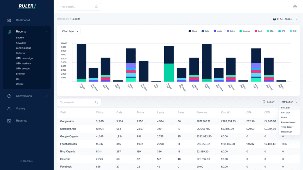
1. Ruler Analytics
Ruler is a marketing attribution tool that centralises your data to reveal which tactics work best to drive pipeline generation.
It tracks how each user finds your site across multiple marketing touchpoints. When an anonymous visitor completes a conversion, whether that’s via form fill, phone call or live chat, Ruler will send all of the data it has captured about your lead to your CRM.
With Ruler’s attribution data in your CRM, you can easily keep track of your leads as they move down the funnel and identify which marketing tactics have the greatest impact on pipeline generation (and which don’t).
When a lead converts into a deal, their revenue and marketing data are sent back to the Ruler database.
This allows you to visualise your data and identify which marketing efforts have the greatest impact on your business.
There’s more yet.
Ruler also offers marketing mix modeling as part of its service. There are three core features that include:
- Impression modeling attribution
- Budget allocation recommendations
- Conversion modeling
Impression modeling: Ruler uses statistical modeling to consider clicks, impressions and offline advertising, such as ad views, TV, and radio.
Budget allocation recommendations: By modelling the saturation curve, Ruler can identify the point of diminishing returns for each advertising channel.
Conversion modeling: Ruler allows you to send MQLs, opportunities, and/or closed revenue back to Google Ads and Meta as conversions for reporting and algorithmic optimisation purposes.
💡 Pro Tip: Ready to take your data visualization to the next level? Ruler scales its pricing to your business, with plans starting at £199. See details on our pricing page or book a demo for a personalised walkthrough and quote.
2. Tableau
Tableau lets users create highly interactive and dynamic visualizations. With its intuitive drag-and-drop interface, marketers can explore, refine, and visualise data in new ways that weren’t possible before.
Tableau’s advanced charting capabilities and native support for multiple data sources allow marketers to quickly combine and analyse data from different sources. The tool’s library of pre-built dashboards and easy-to-use analytics tools enable users to gain insights into trends and identify opportunities for improvement.
3. Google Charts
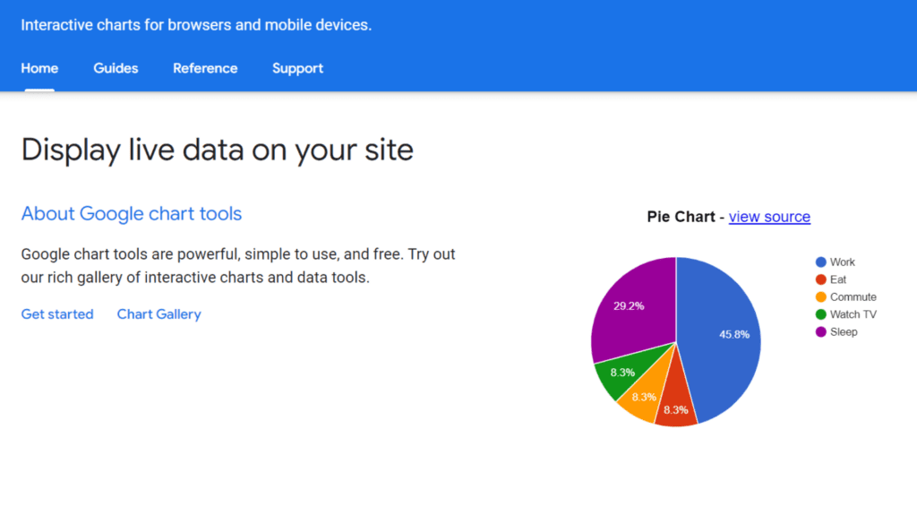
Google Charts allows for the easy creation of charts and graphs without knowing much about coding or design. You can choose from various chart types, including bar, line, pie, scatter, and radar charts. Also, you can customise colours, labels, legends, and titles with just a few clicks.
It’s possible to import data from Google Sheets or paste it directly into the editor. The tool’s embed feature makes it easy to share your creations online. With this feature, you can share your graph on any website or blog in just a few steps.
In addition, you can take advantage of the tool’s comprehensive API documentation that permits automated chart modification.
4. D3.js
D3.js is a powerful open-source JavaScript library designed to help marketers create custom data visualizations. With D3.js, users can easily create a beautiful, accessible data dashboard to display insights engagingly.
The tool has excellent scalability and flexibility, rendering it ideal for creating complex visualizations with multiple data sources. The tool’s intuitive interface makes it easy to use even by beginners. In addition, it supports various chart types like line charts, bar charts, pie charts, and scatter plots.
D3.js can connect with other data sources, such as CSV files and HTML tables. That allows users to easily combine multiple data sources into a single graph or chart for more comprehensive visualiation.
5. Highcharts
Highcharts allow users to create responsive bar charts, pie charts, scatter plots, stock charts, heat maps, timelines, Gantt charts, and network diagrams. It gives marketers the freedom to customise their charts and graphs.
You can easily add annotations, labels, and other data points to your visuals. It also supports real-time updates, so your audience can view the most up-to-date data. In addition, you can zoom in or out, filter data, and export your visualizations in various formats, including PNG, JPEG, PDF, or SVG.
Highcharts is an excellent choice for marketers who need a reliable and easy-to-use data visualization tool. It’s secure, fast loading, and supports multiple web browsers. Moreover, it has an extensive library of learning resources.
6. Plotly
Plotly has a user-friendly interface and robust capabilities, enabling marketers to create customised charts and graphics. It’s also easy to share your data visualizations with colleagues and stakeholders using the tool.
With Plotly, you can choose from various chart types, including:
- Line charts
- Bar charts
- Histograms
The tool has built-in support for mapping and allows you to customise your visuals with annotations, titles, labels, and colours. Furthermore, with its drag-and-drop tools, marketers can quickly assemble graphs and data visualizations from existing datasets.
Plotly aims to make data exploration simpler. Marketers can explore their data and discover trends in real time. The tool’s API integrations enable users to collect data from different sources. That renders it easier to incorporate data into visually appealing graphs.
7. RAWGraphs
RAWGraphs is a free, open-source data visualization tool that can help marketers create stunning visuals in minutes. The interactive web application allows you to upload data and turn it into visually appealing charts and graphs.
The tool provides a library of chart templates and powerful customization options, allowing users to fine-tune their visuals and meet their project’s needs.
Users can also export their work as high-resolution images or scalable vector graphics (SVGs) for further editing in other programs. The tool is ideal for marketers who need to generate visuals quickly without coding or designing from scratch.
8. Chart.js
Chart.js is a powerful and easy-to-use JavaScript library for creating HTML-based charts. It provides a variety of chart types, including line, bar, and radar charts. In addition, it offers intuitive APIs for creating complex, interactive charts.
The tool supports user-created chart captions, icons, and data grouping into different sets. It also provides customization options, such as adding data labels and animations.
Moreover, Chart.js has a vast selection of third-party plugins that allow users to extend their capabilities and use them in more complex scenarios.
9. Leaflet
Leaflet is an open-source library for interactive and mobile-friendly maps. The tool offers many customisation options, including changing the colour of your map and adding labels.
You can also integrate other mapping services, such as Google Maps with Leaflet, allowing you to visualise large datasets easily. The tool runs on all major web browsers, making it a popular choice among marketers looking to create interactive data visualizations.
10. FusionCharts

FusionCharts allows marketers to develop an accessible data dashboard to visualise data in an easy-to-understand format. The library includes multiple chart types, such as column, bar, pie, and line options.
It’s also compatible with major web technologies, including HTML5 and JavaScript. The tool’s intuitive API allows marketers to customise their charts easily.
11. Funnel
Funnel is a marketing reporting tool that unifies data from several platforms and social media channels into a single accessible data dashboard.
It eliminates the need for tedious manual reporting procedures. In addition to its superior interface, the tool offers access to over 500 data sources.
Final thoughts on data visualization tools
Data visualization is an essential tool for marketers as it provides a comprehensive overview of the available data, enabling them to make informed decisions.
Numerous tools can help marketers to visualise data and create compelling visuals. Each tool offers unique features that enable marketers to convey data and insights effectively.
Article by Lukas Pan from Vizlib. The company Vizlib help businesses better understand their data, which allows them to make more informed decisions to grow.